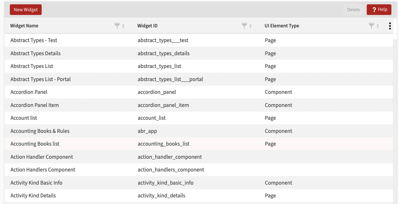
UI Widgets
UI Widgets is the name of the page where you can see existing widgets and create a new one.
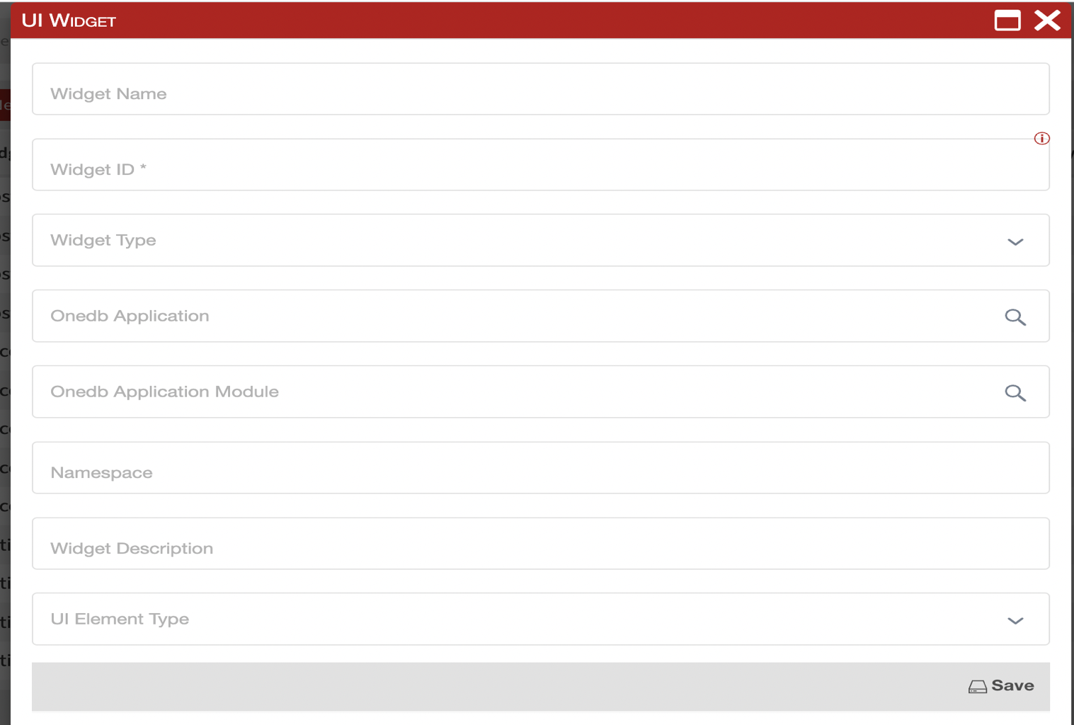
Click the New widget button to open the Widget dialog to add a new Widget. Enter values for the following fields:
- Widget name - Name of the widget
- Widget ID - Unique widget identifier
- Widget type - Select type of the widget from dropdown list of available widget types:
- System - The code is written
- Framework widget - standard widget type
- CSS Template - the appearance of the component is defined
- Mixin - the base class we can use to join it to another widget
- Anybuild application - Select an Anybuild application
- Anybuild application module - Select an Anybuild application module
- Namespace - Set of symbols (names) that are used to identify and refer to objects of various kinds
- Widget description - Description of the widget
- UI element type - UI element type, i.e. Component, Field, Page.
By clicking save, the widget designer opens. Page Designer has three panes: hierarchy, preview and settings.
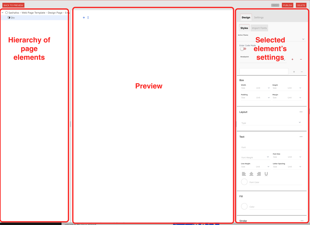
We have a button  - Add New Component Menu. We can add there:
Button, Text Field, Div, Paragraph, Span, Iron Icon, Lookup Field…
On the button  we are allowed to do: Build, Clone or Delete widget.
For each added component, we have the option to add new subcomponents on the button, and to delete the component on the button.
When we select a widget, component, subcomponent, on the right side of the screen, two tabs are loaded, where we additionally define it - Design and (Widget) Settings(Settings — for the component, subcomponent…).
Design
Section titled “Design”Design is the place to customize the appearance of the widget.
The Design tab contains two subtabs — Styles and Import Fonts.
Styles - way to define CSS styles
Import Fonts - way to imports custom fonts to your widget
Widget Settings
Section titled “Widget Settings”Settings is the place for additional adjustment.
Widget Settings contains sections:
- General
- Properties
- Observers
Properties
Section titled “Properties”Understanding widget properties and their effects.
Observers
Section titled “Observers”Working with widget observers for dynamic behavior.
Calendar Widget
Section titled “Calendar Widget”Creating and configuring calendar widgets.
Data Entry
Section titled “Data Entry”Data entry widgets and their configuration.
Example Web Page Widget
Section titled “Example Web Page Widget”Example implementation of a web page widget.